

Responsive web applications play a vital role in delivering dynamic and device-agnostic digital experiences to users. This article explores the significance of building responsive web applications and provides insights into key development considerations, design principles, and the benefits they offer for user engagement. By prioritizing responsiveness, businesses can ensure their applications adapt seamlessly to various devices, providing a consistent and optimized experience to users.
Understanding the Importance of Responsive Web Applications:
The Significance of Device-Agnostic Experiences:
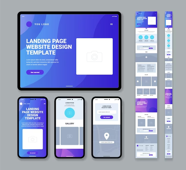
Responsive web applications adapt to different devices, including desktops, tablets, and smartphones, ensuring a seamless experience for users regardless of the device they use. Device-agnostic experiences improve user satisfaction, engagement, and accessibility.
Benefits of Responsive Web Applications:
Responsive web applications provide numerous benefits, such as increased reach, improved user experience, reduced maintenance efforts, higher conversion rates, and better search engine visibility. They allow businesses to cater to a broader audience and stay competitive in the digital landscape.
Key Development Considerations for Responsive Web Applications:
Responsive Design and Fluid Layouts:
Implement responsive design principles and fluid layouts that adjust dynamically to different screen sizes and resolutions. This ensures your web application looks and functions optimally on various devices.

Mobile-First Approach and Progressive Enhancement:
Adopt a mobile-first approach, designing and developing for mobile devices first and then scaling up to larger screens. Apply progressive enhancement techniques to deliver core functionality across all devices while taking advantage of device-specific capabilities.
Flexible Images and Media Queries:
Optimize images and use media queries to deliver appropriately sized and optimized visuals based on the device’s screen size and resolution. This helps minimize page load times and improve overall performance.
Touch-Friendly Interactions and Gestures:
Ensure your web application incorporates touch-friendly interactions, such as swipe gestures and pinch-to-zoom, to provide a seamless and intuitive user experience on touch-enabled devices.
Performance Optimization and Fast Load Times:
Optimize the performance of your web application by minimizing file sizes, leveraging browser caching, and reducing the number of HTTP requests. Fast load times are crucial for providing a smooth user experience and reducing bounce rates.
Design Principles for Building Responsive Web Applications:
Consistent User Interface and Visual Branding:
Maintain a consistent user interface and visual branding across devices, ensuring a cohesive experience that aligns with your brand identity. Consistency builds trust and familiarity with your users.
Intuitive Navigation and User-Centric Design:
Design intuitive navigation menus and user interfaces that allow users to easily access information and perform actions regardless of the device they are using. User-centric design focuses on meeting the needs and expectations of your target audience.
Scalable Typography and Readability:
Use scalable typography that adjusts seamlessly to different screen sizes, ensuring optimal readability on all devices. Consider factors like font size, line spacing, and contrast to enhance legibility.
Optimized Form Inputs and Error Handling:
Design form inputs and error-handling mechanisms that are optimized for various device inputs, including touchscreens and keyboards. Consider input validation, real-time feedback, and clear error messages to provide a smooth form-filling experience.
Seamless Content Adaptation and Progressive Disclosure:
Adapt your content seamlessly to different devices, prioritizing the most important information and progressively disclosing additional details as needed. This ensures a focused and streamlined user experience across devices.
Like Responsive Web Applications, you may also like to read Website Redesign: Revamping Your Online Presence for Modern Audience Preferences
Frequently Asked Questions
How does responsive web application development impact SEO?
Responsive web applications contribute positively to SEO as they provide a better user experience, reduce bounce rates, and improve mobile-friendliness, which is a crucial factor in search engine rankings.
Can existing web applications be made responsive?
Yes, existing web applications can be made responsive through a redesign and redevelopment process. By applying responsive design principles and optimizing the codebase, existing applications can be transformed into responsive ones.
How can I test the responsiveness of my web application across different devices?
There are various tools and approaches to test the responsiveness of web applications. You can use browser developer tools to simulate different screen sizes, utilize online responsive testing tools, or perform real device testing using physical devices or emulators.
What is the difference between responsive design and adaptive design for web applications?
Responsive design uses fluid layouts and media queries to adapt to different screen sizes and resolutions, providing a consistent user experience. Adaptive design, on the other hand, creates separate layouts for specific devices or breakpoints. Responsive design is more flexible and future-proof, while adaptive design offers more control over device-specific optimizations.
How can I optimize images for responsive web applications?
To optimize images, consider using responsive image techniques such as the srcset attribute or the picture element with different image sizes. Compress images to reduce file size without sacrificing quality. Use modern image formats like WebP or JPEG 2000 for better performance.
What is the role of performance optimization in responsive web application development?
Performance optimization is crucial for responsive web applications as slow loading times can negatively impact user experience and lead to higher bounce rates. Techniques like image optimization, minification of CSS and JavaScript, caching, and lazy loading can significantly improve the performance of responsive web applications.
How can I ensure accessibility in responsive web applications?
To ensure accessibility, use semantic HTML elements, provide alternative text for images, and implement proper focus management for interactive elements. Ensure text is readable and has sufficient contrast. Test your application with assistive technologies to identify and address any accessibility issues.
What are the challenges of testing responsive web applications across different devices and browsers?
Testing responsive web applications across various devices and browsers can be challenging due to differences in screen sizes, device capabilities, and browser rendering engines. It’s important to use a combination of physical devices, emulators, and browser developer tools to test and debug your application thoroughly.
Should I prioritize a mobile-first or desktop-first approach in responsive web application development?
The mobile-first approach is generally recommended as it prioritizes designing and developing for smaller screens first and then progressively enhancing the application for larger screens. This approach ensures a solid foundation for mobile users and allows for more seamless scaling of features for larger screens.

Conclusion:
Responsive web applications are crucial for building dynamic and device-agnostic digital experiences. By understanding the importance of responsiveness, considering key development considerations, and applying design principles, businesses can create web applications that adapt seamlessly to different devices, providing consistent and optimized experiences. Responsive web applications enhance user engagement, improve accessibility, and contribute to increased brand visibility and competitive advantage in the digital landscape.